Subject: Request for Additional Data Transparency/Availability
Mr. Ehlmann,
I have been a resident of St. Charles County for 33 years and am incredibly proud to call it home for me, my wife and our 4 children. I value the service that you and your colleagues have provided during that time to the over 400,000 residents under your charge and I thank you for all of your many efforts to make St. Charles County such a wonderful place.
I am writing to you today to request additional information and data resources around Covid-19 in St. Charles County. I have been following closely the disease in our County since the first case was announced in March and have been manually tracking the numbers on a daily basis. The Covid-19 dashboard that was released is helpful and provides some insight into the numbers, but I desire and wish for some additional insight. I wish to begin a discussion around how the County might share the underlying data tables to the residents, empowering them to perform analysis and make the graphs that they find valuable. I understand that many people are not as into data as I am, but I believe that there is value in being as transparent as possible with the citizens. I understand that there are possible HIPAA concerns and other legalities that must be considered, but I was hoping to see if it might be possible to even just start by sharing the data that drives the current dashboard.
At the moment, you can see the number of Total Deaths, but you cannot see the day to day # of deaths in a table. You can see the numbers broken out by each Zip Code if you click on that portion of the map, but you cannot find the Zip Code level data in a table. You can filter and see all of the data by gender or race, but none of that data is available in a table. This lack of tabular data has led to an inability to do any type of detailed analysis of trends and impacted populations.
Currently, I am creating and tracking the Estimated Active Cases, as that number is more meaningful than the much reported Cumulative Totals. I use this calculated value to determine what the 7 and 14 day trend is for Cases the County, which many people have found useful. I have attached today's graph of the Active Cases for reference. (Additional graphs can be found here, if desired.)
I understand that this has been an unforeseen global event, and I do appreciate the data that the County has made available. However, I do believe that we can work to make the data even more transparent and available for residents who, like myself, might find more data availability a great thing.
I welcome any comments, suggestions and discussion, as I hope to improve what our wonderful County has already put in place. Thank you again for your time and for your service.
Respectfully,
Jeremy Walker
CC:
Doug Bolnick - Director Public information Officer
Mary Enger - Director, Communications
Matthew Seeds - Director, Information Systems
Showing posts with label data. Show all posts
Showing posts with label data. Show all posts
Open Letter to St. Charles County Executive Steve Ehlmann
I have just sent the following email to our County Executive (and others), in the hopes of beginning a conversation around how the County might improve the sharing of Covid-19 data with concerned residents. I am hopeful that there can be some enhancements and improvements in how the data is shared.

Covid-19 in Saint Charles County - Graphs
Covid-19 Data Issues in Saint Charles County
May 22 Update:
I reached out to the County Health Department about this discrepancy and received the following reply/explanation:
Original post:
I have been tracking the spread of Covid-19 in St. Charles County since the day the first case was announced. For several weeks, the County only had a table of current data on the site, so I was manually tracking daily case totals in a spreadsheet in order to see the trends. Finally, the County utilized PowerBI to provide some graphs of the data in a dashboard format. However, the County had not created some of the graphs that I thought helped better tell the story, so I continue to input and update daily new cases and deaths into my spreadsheet, all based on the published County data.
 Over the course of this pandemic, firm numbers regarding positive cases, and even deaths, have been hard to establish. For Saint Charles County, the tale is no different. Most days, I have to scroll back though the previous days and update a few up or down by 1 or 2 cases. Typically, most of the changes occur to dates within the past 14 days, which makes sense, as this is within the window of symptoms presenting and test results being obtained. However, over the past week, I have noticed that the numbers are changing on dates much further back in time.
I reached out to the County Health Department about this discrepancy and received the following reply/explanation:
The County’s health and information systems departments did switch reporting systems recently and noticed an error in the presentation of reported numbers. This caused the issue you note, and this was corrected as soon as possible.I am not sure if the switch refers to the update to the PowerBI dashboard or if it refers to the actual source they are collecting the data from. I have not nioticed any updates the the actual layout or content of the dashboard, so i assume it is the data source. If the change in source resulted in a greater than 5% negative change in reported cases, then there seems to be valid reason for concern with the validity of the numbers that have been previously reported.
Original post:
I have been tracking the spread of Covid-19 in St. Charles County since the day the first case was announced. For several weeks, the County only had a table of current data on the site, so I was manually tracking daily case totals in a spreadsheet in order to see the trends. Finally, the County utilized PowerBI to provide some graphs of the data in a dashboard format. However, the County had not created some of the graphs that I thought helped better tell the story, so I continue to input and update daily new cases and deaths into my spreadsheet, all based on the published County data.
Active Cases of Covid-19 in St. Charles County
Currently, the County website continues to show cumulative case numbers and does not show active case numbers. I have been tracking this data for over a month and present the below for reference.
Updated 06MAY20
Updated 06MAY20
Current Cumulative Cases: 637
Current Active Cases: 126

Covid-19 Graph Notes
I have published some of the charts that I have created about Covid-19 in St. Charles County, MO. level data. Below are a couple of notes about how I arrived at some of my data points.
Notes:
Notes:
- I have utilized the daily death total that I have been tracking on my own, as the county still does not publish them in a table at the daily level.
- Due to the unavailability of the Recovery data at the county level, I have assumed the standard 14 day recovery window for all cases. I realize that this is variable, but for consistency sake and trend analysis, I felt like this data point was useful.
- I have calculated the number of Active Cases as follows:
- Active Cases = Yesterday's Active Cases + Today's New Cases - Today's Deaths - 14 Day Prior Daily Delta (Defined : Daily New Cases - Daily Deaths Announced)
On the Fiscal Cliff
Thomas Sowell expresses his thoughts about the Fiscal Cliff, and these portions echo exactly what I think and feel:
And there are these nuggets from Part 2:


First of all, despite all the melodrama about raising taxes on "the rich," even if that is done it will scarcely make a dent in the government's financial problems. Raising the tax rates on everybody in the top two percent will not get enough additional tax revenue to run the government for ten days.
No previous administration in the entire history of the nation ever finished the year with a trillion dollar deficit. The Obama administration has done so every single year.
Referring to the Federal Reserve System's creation of hundreds of billions of new dollars out of thin air as "quantitative easing" makes it seem as if this is some soothing and esoteric process, rather than amounting essentially to nothing more than printing more money.
Debasing the value of money by creating more of it is nothing new or esoteric. Irresponsible governments have done this, not just for centuries, but for thousands of years.
It is a way to take people's wealth from them without having to openly raise taxes. Inflation is the most universal tax of all.
But it is not the same politically, so long as gullible people don't look beyond words to the reality that inflation taxes everybody, the poorest as well as the richest.
And there are these nuggets from Part 2:
A key lie that has been repeated over and over, largely unanswered, is that President Bush's "tax cuts for the rich" cost the government so much lost tax revenue that this added to the budget deficit-- so that the government cannot afford to allow the cost of letting the Bush tax rates continue for "the rich."And here are the table and images referred to above:
What is remarkable is how easy it is to show how completely false Obama's argument is.
What both the statistical tables in the "Economic Report of the President" and the graphs in Investor's Business Daily show is that (1) tax revenues went up-- not down-- after tax rates were cut during the Bush administration, and (2) the budget deficit declined, year after year, after the cut in tax rates that have been blamed by Obama for increasing the deficit.

Using Idle Time For Good
The first part of this TED talk surprised me.
It's amazing to think that some of the reCaptchas I have filled in have helped digitize books.
To know that information is not only captured from print media and stored for future reference in a different format is great, but the fact that everyday people are participating in that effort unknowingly is amazing.
Oh, and someday I hope to learn Spanish while translating the web.
US States Compared to Foreign Countries
The Economist released the following map showing the size of each state's GDP as it relates to another country. For example, Missouri's GPD is roughly the same size as Finland's with a population that is equivalent to Paraguay's.
(HT: 22 Words)
(HT: 22 Words)
Passion Week Resources
If you are like most people and have a hard time following where the different events of the Passion week occurred, here is a map with the events located on it. (Of course, certain exact locations are unknown and so I believe this tool is utilizing the most popular traditional locations.)
I am also finding Justin Taylor's Holy Week series to be helpful during this time. In this series, he is capturing all Scriptural references to events that happened on each day this week in the life of Jesus Christ, using the ESV.
(HT: Justin Taylor)
I am also finding Justin Taylor's Holy Week series to be helpful during this time. In this series, he is capturing all Scriptural references to events that happened on each day this week in the life of Jesus Christ, using the ESV.
(HT: Justin Taylor)
Money Makers
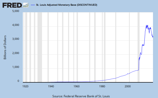
I posted the following FRED graph in April 2009, with this paragraph:
Here's the status as of today:
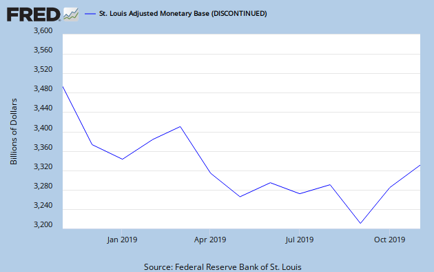
 In order to bring more clarity to the ongoing devaluing of the dollar, below is the activity of only the last year, so we can see the atrocity up close:
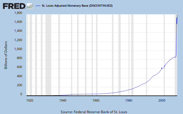
 Who says you can't spend what you don't have? Our government does just that and then prints more money to reduce the deficit between their spending versus available funds. I fully anticipate to see this line continuing to trend upward, much to my dismay and as an ever-increasing, impending threat to our nation's economic security.
Reason #4 – The devaluing of our currency is an economic and moral nightmare.To be clear, this is a graph of the amount of money that the Federal Reserve Bank has printed and is currently in circulation in the United States of America.
The Federal government has pumped so much cash into the economy over the past 6 months that it would seem altogether impossible for this action not to result in inflation, at best, or hyperinflation, at worst. Either outcome is harmful to American and its citizens and should be avoided by all means necessary. At this point, the question is how to begin reducing the amount of currency in circulation and the answer is one that the Federal government refuses to accept: let the free market correct itself and determine the true value of the dollar. While such action will undoubtedly lead to tougher times ahead, this correction is necessary to overcome the mistakes of our past and ensure that we are standing on solid financial ground in the future.
Here's the status as of today:
Water Consumption on Ice
From this post:
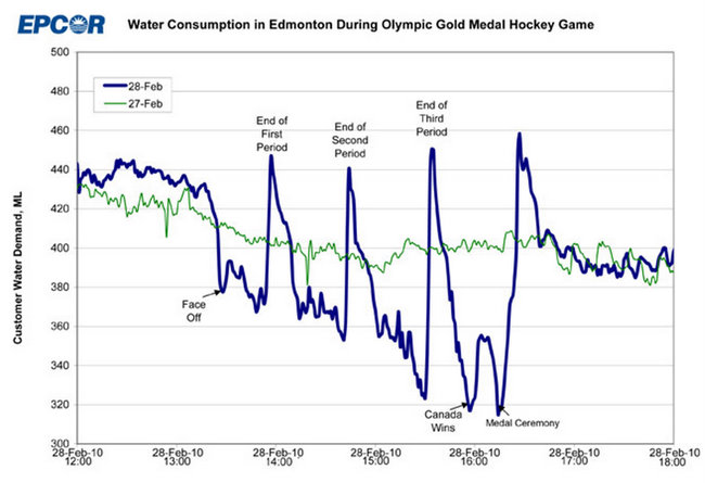
Everyone waited to use the restroom until the periods were over! Simply awesome!
The water utility in Edmonton, EPCOR, published the most incredible graph of water consumption last week.
Everyone waited to use the restroom until the periods were over! Simply awesome!
What Uncle Sam's House Looks Like
Since Lisa and I have been working diligently on getting out of debt (excluding the house debt), I find myself continuously perturbed by the actions of our Federal Government (read "Total Outstanding Debt Owed by the US Federal Government"). When I think about how hard Lisa and I have worked to eliminate our debt by making some tough choices and sacrificing certain luxuries, it infuriates me to see how our government is spending the money that it took from us and is taking from our future paychecks.
The method that Lisa and I have used to become debt-free is quite simple: spend less than you make. In doing so, we have had to plan to save for future known expenses (ie insurance, renovations), while reducing our expenditures. This has led us to where we are today, on the verge of not having a monthly bill associated with credit card or student loan debt. (As an aside, we never carried a balance on our credit card, but we have stopped using it anyway.) It's a great place to be and we are looking forward to the financial freedom we will have in the future because of the decisions we have made over the past few years.
The method that Lisa and I have used to become debt-free is quite simple: spend less than you make. In doing so, we have had to plan to save for future known expenses (ie insurance, renovations), while reducing our expenditures. This has led us to where we are today, on the verge of not having a monthly bill associated with credit card or student loan debt. (As an aside, we never carried a balance on our credit card, but we have stopped using it anyway.) It's a great place to be and we are looking forward to the financial freedom we will have in the future because of the decisions we have made over the past few years.
Total Outstanding Debt Owed by the US Federal Government
Yesterday, I found myself wondering what the current level of debt owed by the United States government is, as well as what the history is of the United States Federal Government functioning under an outstanding debt. I very quickly found the data here, but I was unable to easily find a clear graphic representation of that information. I created the following graphs to visually represent the total outstanding US debt on an annual basis. (If you want to see something from the near past, you can see the graph I created showing the US National debt change from Ocober 2008 through April 2009.)
As of 03FEB09, the total Outstanding Debt of the United States Federal Government is $12,346,427,470,024.01. That is almost 12 and a half Trillion dollars! I have added a widget to the right-hand side of this blog to track the daily amount of debt owed.
Click each graph to see the larger, more detailed version.
.jpg)
As of 03FEB09, the total Outstanding Debt of the United States Federal Government is $12,346,427,470,024.01. That is almost 12 and a half Trillion dollars! I have added a widget to the right-hand side of this blog to track the daily amount of debt owed.
Click each graph to see the larger, more detailed version.
Subscribe to:
Posts (Atom)